10 Things Every Web Designer Should Be Able to Do in Their Sleep
Some skills, you just need to know. And you better know them so well that you can do them almost without thinking. When it comes to web design, many skills can change and evolve over time, but there are a few basics that you should be able to do in your sleep.
And even if you aren’t a “web designer” by trade, each of these skills is becoming must-have for all designers working today. How many are you already comfortable with? Let’s dive in and take a look at what you should be able to do on “auto pilot”!
1. Code with HTML and CSS
Whether you are a developer or not, everyone needs to understand the most basic of language behind website design. You need to understand how to read, edit and troubleshoot basic HTML. (And depending on your actual job you might need to know a lot more than that.)
In any case, you should be able to pinpoint a bold or font or color or size issue in HTML without thinking. You should be able to substitute styles in CSS with ease. These are skills that are easy to learn and will serve you well in the long run.
Learn it: Refamiliarize yourself (or learn) the basics from W3Schools. The tutorials are self-paced, easy to understand and free. (There’s no reason not to become fluent in the language of the web.)
2. Edit Photos
In any design field, it’s likely that you will work with images all day long. So it only makes sense that you understand how to manipulate them. From basic cropping to sizing and a little “clean up,” you should be able to work with photos with ease. At a minimum, you should feel comfortable with cropping and resizing as well as some image quality adjustment.
Learn it: Digital Camera World has a nifty guide that explains six steps to make the most of photographs. The tips are easy to use and while the tutorial is rooted in Photoshop, it can be applied with any software.
3. Make a Print
While your job might be in the digital realm, parts of the design will no doubt be needed for printed applications. From fliers to business cards to press releases, you should be able to create and convert elements in such a way that are also print-ready.
Key things to understand include printing resolutions for different media types and color. While you likely use a value such as FF0000 to make a text block red, that won’t work for printing. (It will at least look funny.) CMYK (cyan, magenta, yellow, black) color mixes are the standard for printed items.
Learn it: Lucky for you we have a guide to getting something ready to print. It explains the differences in color, mediums, typefaces, bleeds and more.
4. Write a Headline
It’s near impossible to really visualize a design with lorem ipsum as the main headline. The words are the glue that bring the visuals and the message together. Your headline might not always stick, but you should always fill in the big words when you turn in a design concept.
As a practical matter, the words can help the client understand how much space is available for text. A good headline shows that you understand the client and go the extra mile in projects and it leaves people with a lasting impression.
Learn it: Copyblogger is a great resource when it comes to the ins and outs of copy. Start with “How to Write Headlines the Work.”
5. Grab Any Device and Navigate a Website

You should have a comfort level with computers and devices that most people do not. This might require breaking away from your favorite devices or browsers or programs and playing with plenty of other things. (You’ll be thankful if you do, guaranteed!)
We’ve all been there: There’s nothing worse than a client whipping out an old phone or showing you something on a small screen for help and you just can’t figure it out with ease. You should be able to use your website (and others) in any environment and talk others through how to do it as well.
Learn it: Just start playing. Make sure to experiment with different browsers and if you are an Apple person, pick up an Android device (and vice versa).
6. Sketch with Confidence
One of the greatest thing about sketching is that you can help others visualize what you are thinking. Remember, plenty of other people need to see a wireframe or outline before they can start to imagine what you are thinking.
Sketching with confidence is a great way to help create that connection. This is not to say you need to learn to be a top-notch artist overnight. But you should come ready with a pad and pen (or pencil) so you can put those ideas on paper and share them with the team.
Learn it: Tuts+ has a great little primer on learning to draw. The first step? Quit trying to be perfect.
7. Use a Common Framework
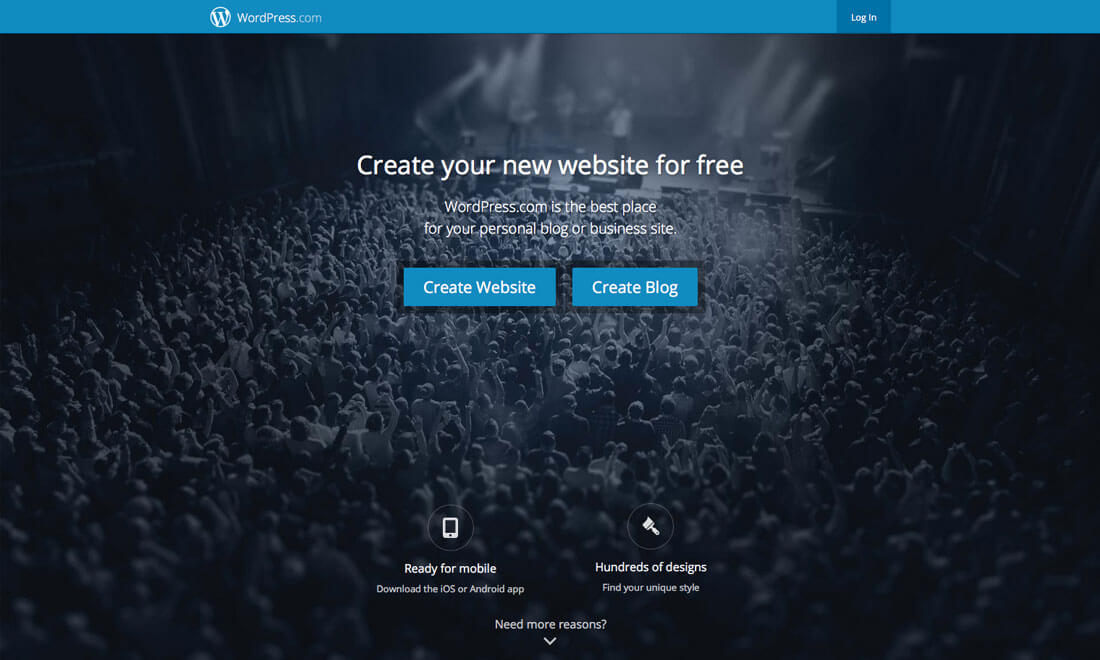
There is no shame in using a website design framework to kick-start projects. In fact, you probably should unless you are a super-star developer.
Frameworks keep you from reinventing the wheel with every project and are easy for others to use if you are ultimately handing a website over to a client that will try to maintain it and make updates. WordPress is a popular option, but there are plenty of others out there to try.
Learn it: Start with WordPress. It’s the largest blogging and website content management system and framework available. (And it’s pretty easy to use.)
8. Backup and Package Files
While a website seems to be a self-containing system, it is not. You need to understand how to and how often to backup your site (and restore it, if necessary) to prevent data loss should something happen to the site. (It’s better to be safe than sorry, right?) Even if you don’t know the exact logistics of this exercise in your sleep, you should know what is being saved, how frequently it is happening and where the data is stored.
In addition, you should have a good idea of how to create package files for website styles, design parts and pieces and more that can be used as a backup and can provide vital information for clients should they need to use the parts. Package files (for print) are a necessary part of the web design process as well so clients have a set of branding tools that match the website design for printed promotions. (Clients will love you for this!)
Learn it: Every website needs a backup plan. Packaging files will help you keep materials, such as fonts and images, together when you have to send them elsewhere.
9. Know 3 Trends (And When To Use Them)

You should have a go-to website trends elevator pitch. What does this mean?
Simply, you should be able to talk to anyone with a reasonable amount of design knowledge about what visual techniques are trending and why or why you should not use them. How do they work and what do you like/dislike about these trends.
Learn it: Read design blogs such as this one to stay up-to-date on what is trending and how those design techniques can be applied.
10. Explain Design Theory
Color, flow, balance and proportion, spacing: These are all things that you should just be able to see when working on projects. But it’s more than having a good eye; design theory is equally important. Understanding why you do what you do and why that creates a well-balanced aesthetic is important.
And if you understand it well, you can explain it and more easily defend and explain design decisions to others. A foundation in the basics will help you master any project.
Learn it: If you don’t already have this one down, it might be time to go back to the basics. Start with “Design Basics” by Stephen Pentak and “Graphic Design: The New Basics” by Ellen Lupton and Jennifer Cole Phillips.
Conclusion
How many elements on this list can you check off as things you know in your sleep? How many others are you eager to go learn more about or refresh your skillset?
Web design – like any other type of design – is rooted in the basics and sprinkled with plenty of trends and new techniques. A good understanding of the mix will help you grow and become a better designer, and will help you feel even more confident in your design decisions and work.
And even if you aren’t a “web designer” by trade, each of these skills is becoming must-have for all designers working today. How many are you already comfortable with? Let’s dive in and take a look at what you should be able to do on “auto pilot”!
1. Code with HTML and CSS

Whether you are a developer or not, everyone needs to understand the most basic of language behind website design. You need to understand how to read, edit and troubleshoot basic HTML. (And depending on your actual job you might need to know a lot more than that.)
In any case, you should be able to pinpoint a bold or font or color or size issue in HTML without thinking. You should be able to substitute styles in CSS with ease. These are skills that are easy to learn and will serve you well in the long run.
Learn it: Refamiliarize yourself (or learn) the basics from W3Schools. The tutorials are self-paced, easy to understand and free. (There’s no reason not to become fluent in the language of the web.)
2. Edit Photos
In any design field, it’s likely that you will work with images all day long. So it only makes sense that you understand how to manipulate them. From basic cropping to sizing and a little “clean up,” you should be able to work with photos with ease. At a minimum, you should feel comfortable with cropping and resizing as well as some image quality adjustment.
Learn it: Digital Camera World has a nifty guide that explains six steps to make the most of photographs. The tips are easy to use and while the tutorial is rooted in Photoshop, it can be applied with any software.
3. Make a Print

While your job might be in the digital realm, parts of the design will no doubt be needed for printed applications. From fliers to business cards to press releases, you should be able to create and convert elements in such a way that are also print-ready.
Key things to understand include printing resolutions for different media types and color. While you likely use a value such as FF0000 to make a text block red, that won’t work for printing. (It will at least look funny.) CMYK (cyan, magenta, yellow, black) color mixes are the standard for printed items.
Learn it: Lucky for you we have a guide to getting something ready to print. It explains the differences in color, mediums, typefaces, bleeds and more.
4. Write a Headline
It’s near impossible to really visualize a design with lorem ipsum as the main headline. The words are the glue that bring the visuals and the message together. Your headline might not always stick, but you should always fill in the big words when you turn in a design concept.
As a practical matter, the words can help the client understand how much space is available for text. A good headline shows that you understand the client and go the extra mile in projects and it leaves people with a lasting impression.
Learn it: Copyblogger is a great resource when it comes to the ins and outs of copy. Start with “How to Write Headlines the Work.”
5. Grab Any Device and Navigate a Website

You should have a comfort level with computers and devices that most people do not. This might require breaking away from your favorite devices or browsers or programs and playing with plenty of other things. (You’ll be thankful if you do, guaranteed!)
We’ve all been there: There’s nothing worse than a client whipping out an old phone or showing you something on a small screen for help and you just can’t figure it out with ease. You should be able to use your website (and others) in any environment and talk others through how to do it as well.
Learn it: Just start playing. Make sure to experiment with different browsers and if you are an Apple person, pick up an Android device (and vice versa).
6. Sketch with Confidence
One of the greatest thing about sketching is that you can help others visualize what you are thinking. Remember, plenty of other people need to see a wireframe or outline before they can start to imagine what you are thinking.
Sketching with confidence is a great way to help create that connection. This is not to say you need to learn to be a top-notch artist overnight. But you should come ready with a pad and pen (or pencil) so you can put those ideas on paper and share them with the team.
Learn it: Tuts+ has a great little primer on learning to draw. The first step? Quit trying to be perfect.
7. Use a Common Framework

There is no shame in using a website design framework to kick-start projects. In fact, you probably should unless you are a super-star developer.
Frameworks keep you from reinventing the wheel with every project and are easy for others to use if you are ultimately handing a website over to a client that will try to maintain it and make updates. WordPress is a popular option, but there are plenty of others out there to try.
Learn it: Start with WordPress. It’s the largest blogging and website content management system and framework available. (And it’s pretty easy to use.)
8. Backup and Package Files
While a website seems to be a self-containing system, it is not. You need to understand how to and how often to backup your site (and restore it, if necessary) to prevent data loss should something happen to the site. (It’s better to be safe than sorry, right?) Even if you don’t know the exact logistics of this exercise in your sleep, you should know what is being saved, how frequently it is happening and where the data is stored.
In addition, you should have a good idea of how to create package files for website styles, design parts and pieces and more that can be used as a backup and can provide vital information for clients should they need to use the parts. Package files (for print) are a necessary part of the web design process as well so clients have a set of branding tools that match the website design for printed promotions. (Clients will love you for this!)
Learn it: Every website needs a backup plan. Packaging files will help you keep materials, such as fonts and images, together when you have to send them elsewhere.
9. Know 3 Trends (And When To Use Them)

You should have a go-to website trends elevator pitch. What does this mean?
Simply, you should be able to talk to anyone with a reasonable amount of design knowledge about what visual techniques are trending and why or why you should not use them. How do they work and what do you like/dislike about these trends.
Learn it: Read design blogs such as this one to stay up-to-date on what is trending and how those design techniques can be applied.
10. Explain Design Theory
Color, flow, balance and proportion, spacing: These are all things that you should just be able to see when working on projects. But it’s more than having a good eye; design theory is equally important. Understanding why you do what you do and why that creates a well-balanced aesthetic is important.
And if you understand it well, you can explain it and more easily defend and explain design decisions to others. A foundation in the basics will help you master any project.
Learn it: If you don’t already have this one down, it might be time to go back to the basics. Start with “Design Basics” by Stephen Pentak and “Graphic Design: The New Basics” by Ellen Lupton and Jennifer Cole Phillips.
Conclusion
How many elements on this list can you check off as things you know in your sleep? How many others are you eager to go learn more about or refresh your skillset?
Web design – like any other type of design – is rooted in the basics and sprinkled with plenty of trends and new techniques. A good understanding of the mix will help you grow and become a better designer, and will help you feel even more confident in your design decisions and work.

Comments
Post a Comment
Please Leave Your Comment Here